
Cougars Climb Higher
The Office of Student Retention & Educational Innovation provides several pathways to support and/or develop student programming that enriches experiences, builds cohesion and a sense of belonging to the University, as well as foster warm relationships with peers, faculty members and staff.
Responsibilities
Art Direction / Brand Identity / Brand Strategy / Motion Graphics / Merchandise Photography
Spotlight
A massive thank you to Hannah Seda for modeling for me. Check out her portfolio!
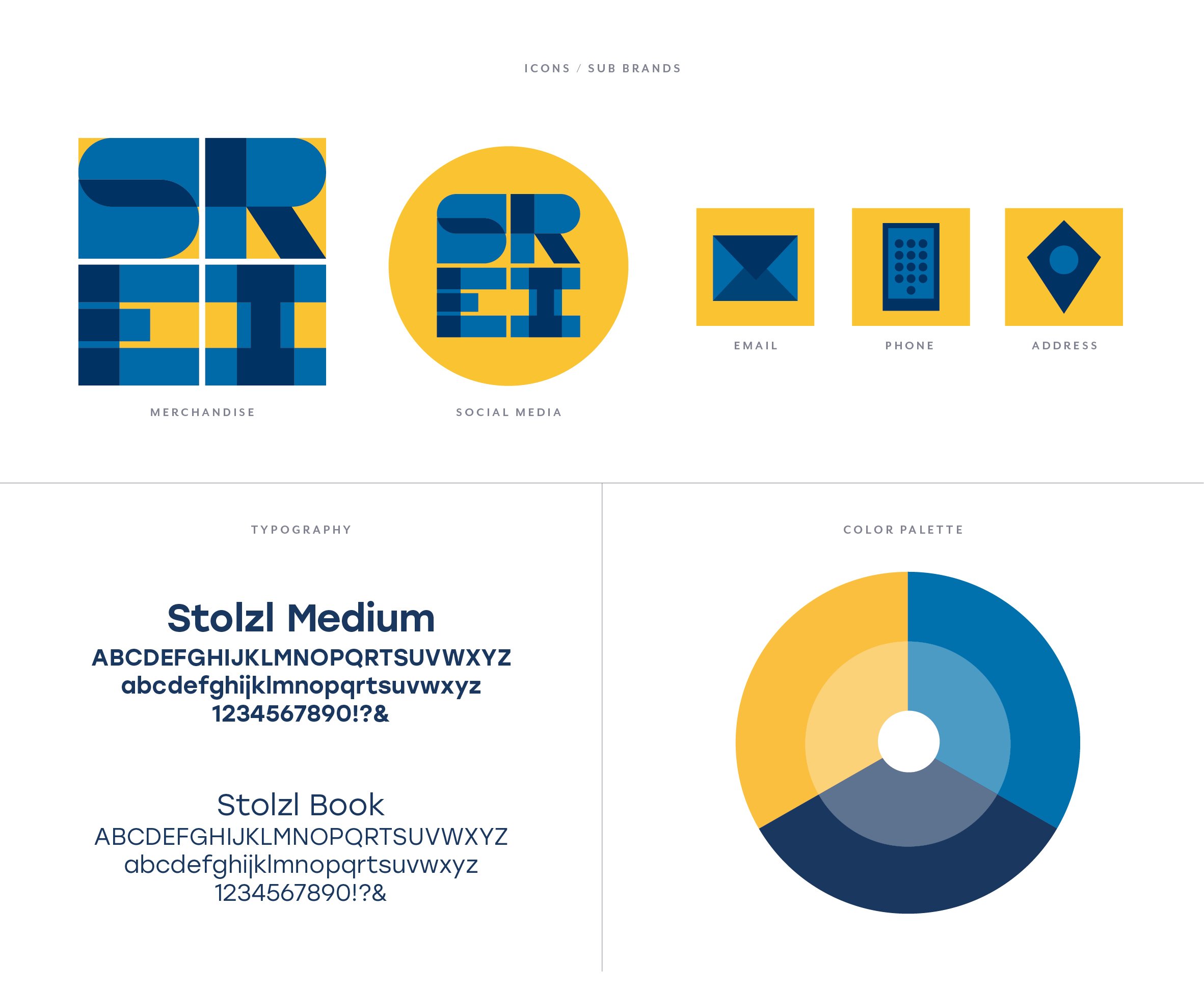
Logo Concept
This brand new identity highlights a dominant square shape representing a strong & stable foundation, which the office provides. Within those sturdy shapes, the overlapping letterforms convey a sense of change and even some playfulness. By being contained within their own boxes, it showcases the retention aspect of the program. This motif of the square repeats throughout the identity such as in the pattern and the business cards.
Branding Board
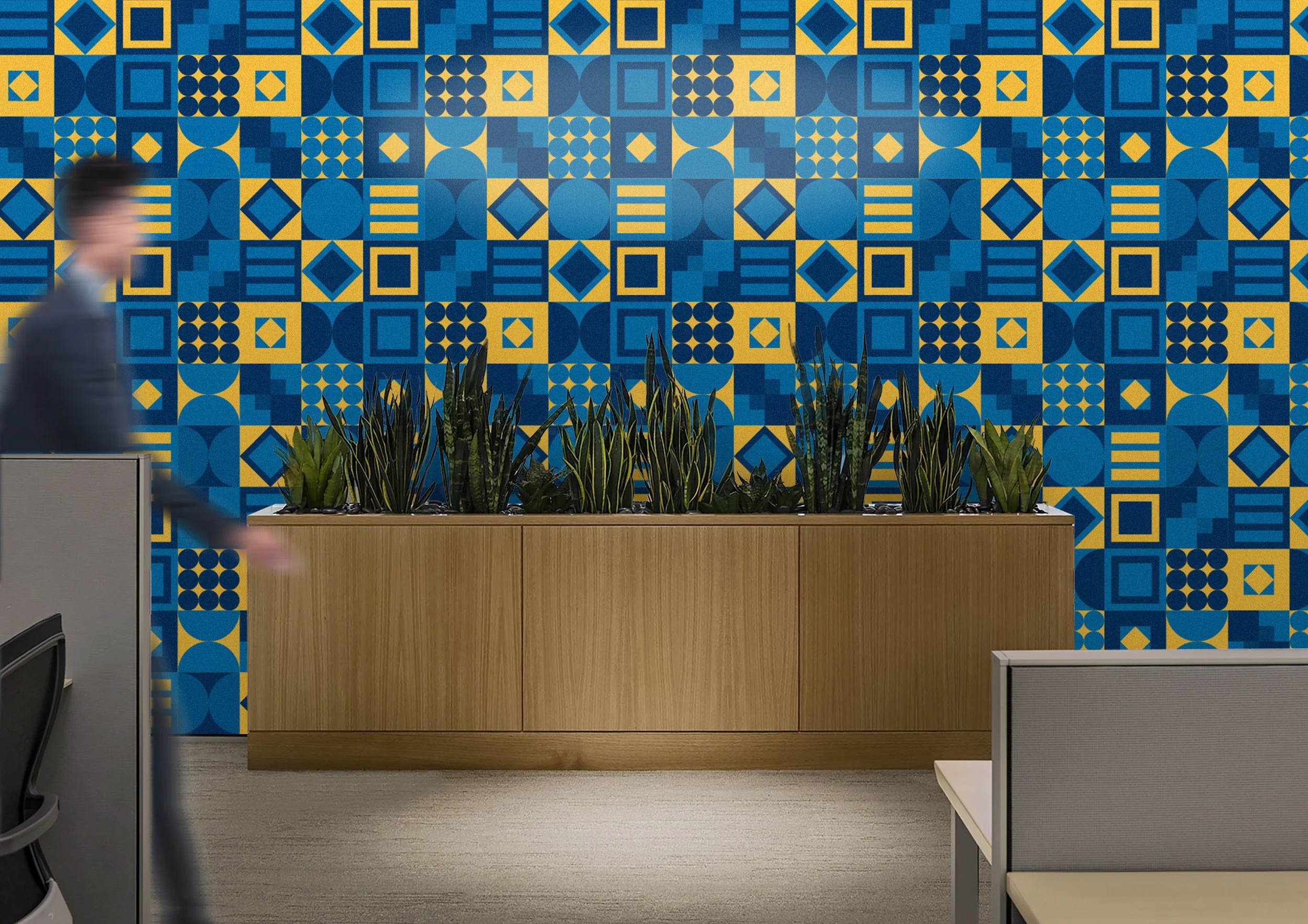
The color palette uses dominant warm hues to bring in a sense of home and brightness, but also includes cooler hues to show diversity and contrast. The diverse pattern signifies the uniqueness of the student body and within it, there are several shapes that represent different aspects of the experience at Kean; Uniform circles show unity as a group, shapes inside shapes and overlapping squares imply working together, and horizontal rectangles representing equality and equity.
Office Mood Board
What I want the office to look like — lots of bright yellow accents and plants to make it feel like a second home.


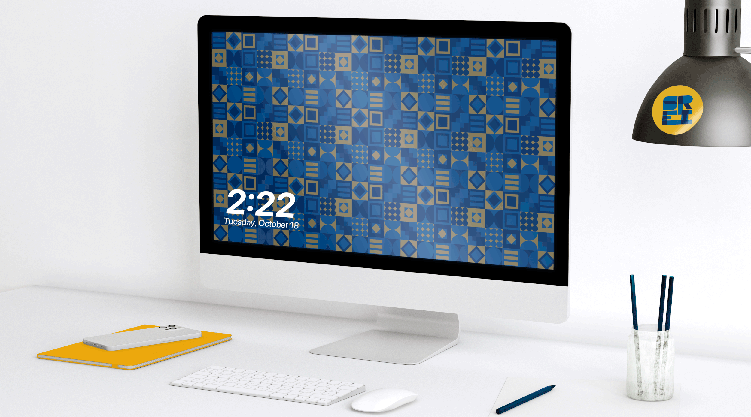

Wait! The time on the clock changes :)

Stationery
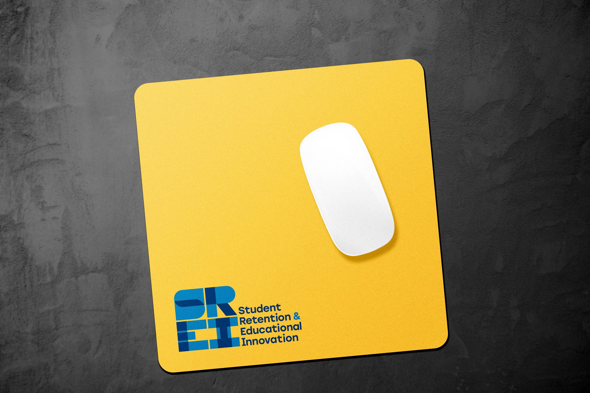
An array of paper products to send to students, parents, and other departments that are as fun and bright as the faculty. The business cards especially are square to retain the shape of the logo.


Print & Digital


Merchandise & Signage


